Interviews

A cockerel for a handbag, a woven poodle for a bottle. Packaging in the communist Poland

The 1960s was the time of the great packaging verification campaign. More than 90 percent of packaging failed. Producers were given six months to change their boxes, cans, jars and labels under the threat of consequences," says Katarzyna Jasiołek, author of "Packaging, or the Perfuming of Herring".

TVP WEEKLY: You say "packaging in the communist Poland", you think - collecting. Especially those of us who remember those days probably have in front of our eyes soda cans stacked on top of each other, files of Donald chewing gum stories or carefully collected sugar bags, because they were the main assortment for packaging in those days.

KATARZYNA JASIOŁEK:
I'm the younger generation of the time, born in the 1980s, so I didn't experience or remember some of these elements of collecting. But it's true that I first saw a canned food display at my cousin's house, I remember the stickers that came with Kukuruku wafers in the 1990s, and I myself used to collect juice cartons with straws and pictures of cars from Turbo chewing gum. It was a breath of the West in times of transition.

As far as the packaging and the Poles' love of this specific, from today's perspective, collecting are concerned, it was probably dictated by the fact that these were some of the prettiest, if not the prettiest things an ordinary mortal could get his hands on. Antiques are a higher degree of initiation, and you didn't even have to spend money on packaging. You hunted for them under the rubbish heaps, you could scrounge them from your family or ask them to put them away in the grocery shops. It was applied art, very democratic because it was accessible to everyone, large and small. It fascinated with colours, which were scarce in the communist era. In the book I mention that when Poles went to the West, they could not take their eyes off the shop windows, which were full of colours, lacquered cardboard packaging, plastic packaging. It was so amazing to them that it was hard not to want to have it at home for a long time afterwards and not to enjoy at least the colourful packaging brought back from the trip.

In 2020, your book "Asteroid and Half-Couch" about Polish post-war design was published. Furniture, ceramics or glass from the communist era reach dizzying prices at auctions, disappear from bins in five minutes, and social media groups are created dedicated to such objects. Is it the same with packaging?

Compared to post-war design, packaging gems are really few. I have the impression that it was during the transformation period that things were thrown away even faster than furniture or vases, which is why very few of them have survived. Back in the days of communist Poland, no one would throw away a tin of jelly beans or a box of cocoa, and you could hardly find tins, boxes or any other kind of packaging that would be useful in the kitchen. Now these cans, bottles or paper from those years are not obvious treasures. The latter is practically impossible to find. Passionate auctioneers fight like lions for it. Besides, when factories or institutions were liquidated after the fall of the People's Republic of Poland, design documentation was also thrown away. This applied to furniture and glass factories, as well as printing and packaging plants. Only a few miraculously survived in private hands of people who not only created them, but also found, bought and saved them from oblivion.
In the late 1950s and early 1960s, the discussion began about the need to improve the quality of packaging. Previously, it had been assumed that the customer would buy everything anyway. Photo: Katarzyna Jasiołek archive
Do these boxes, like armchairs or tables, fetch exorbitant prices at auction?

Apparently, there are collectors of cigarette packets with their full contents and they can even pay tens of thousands of zlotys for a collection of such packets. What illustrated my book are the collections of people who are interested in design as such, and at the same time buy packaging as a beautiful example of graphics, an interesting design. As I mentioned, as a fan of design from those years I tried to buy single sheets of wrapping paper to add to my collection and for the purpose of the book, but I often had no chance against a dozen or so people who also fought over them.

In the title of your book you compare packaging to a 'perfumed herring'. Whose words are these?

The godfather of this title and statement is Roman Duszek, a Polish graphic designer who has designed graphic signs as well as packaging. When we started exchanging e-mails about the book, I wrote him that I had bought a pack of blue shadows by Kamelia at an antique market. He wrote back that it was a perfect example of "perfuming the herring". This statement defines well what was going on in the packaging industry and in post-war design. The designer tried very hard, chose the colours, and since they were graduates of the Academy of Fine Arts, they knew their colours and designed everything very carefully. Later, when you went to the commission with such a project, as Duszek told me, a small deception was used, namely, to make the colours more intense, a film was put over the project. After the commission passed the project, it went into production and if it was printed on paper, the designer often did not recognise his work in the final version. The colours were different, the background was beige or grey instead of white. In the case of the aforementioned shadows, the scales were golden in design, but came out dirty green in production. The print shop often used whatever colours were available. As Duszek said, no matter how hard you try, you still can't mask the smell of herring. That's exactly what happened with the packaging. It hurt the graphic designers, but deficits in paints or the poor quality of products used to make packaging seemed insurmountable. Just the inertia of a centrally controlled economy.

Packaging is primarily associated with paper. Was this material readily available?

Wrapping paper was a great luxury. In fact, it is probably still associated with the communist era. The tulip-shaped paper available at the Municipal Department Store (MHD) or the windmills at the Centrum Department Store brought parcels of clothes or accessories to my house. However, during the entire communist era, this was a scarce commodity, just like metal. Commerce received it from the paper industry, which was unable to meet the quantitative needs of retail and the demands for types of bags and wrapping paper. Due to their intended use, the latter were made from the worst-quality raw materials and were therefore less profitable for the manufacturer than full-quality paper. There was a shortage of white paper bags with a capacity of half a kilo, which for aesthetic reasons would be suitable for packing sweets or packaging with occasional and advertising prints.

Instead of mazurek cakes, butterscotch wafers. Easter eggs to eat and admire. Galician cuisine unites Ukrainians and Poles

Local salt, honey, rosehip jam... The main difference: Poles favour sour flavours, Ukrainians sweet ones.

see more
In theory, industry produced to order of commerce; in practice, what came off the production belts was what was most advantageous to the factory at the time in terms of price and productivity. An example is the data from 1959. The industry's order was for 500 tonnes of bags of one-eighth of a kilo, and only 25 tonnes were received. As the standards specified the weight of the wrapping paper and not the number of sheets, the shops often received thick paper which was insufficient in number and inconvenient to pack in.

In the 1960s, a regulation came into force which was not conducive to the aesthetics of paper packaging, but was aimed at saving paper. Books had to be smaller, margins had to be narrower, labels had to be smaller, some cardboard boxes had to be abandoned. If there was nothing to pack in, it was packed in newspaper. Printing paper was also a problem. If it was not too thick to pack the goods, it was of poor quality, transparent, too thin to print a design or a producer's logo on it. Paper manufacturers used to hide behind the statement that the value of the goods was determined by the product itself and not by what it was wrapped in. This was, as the modern world shows, a misconception.

And how was it with the cans?

Just as bad. The fishing industry was getting too little sheeting for its needs, and when it did get it, it was too thick, unpainted sheeting. This poor quality meant that when you opened the tin, you could sometimes see a worryingly dark shade of plastic. Canned fish also did not encourage people to buy them, as they were sometimes smeared with the contents, and if the contents were oily, the label would not stick to the can. Although I have examples of beautiful labels for tinned food in my book, these were rather glorious exceptions.

Paint or varnish manufacturers also had a problem with a shortage of tin, as they sometimes failed to complete a plan due to a lack of tin for product packaging. However, there is also another type of tins - lithographed tins for sweets, coffee, tea, cocoa, which can be considered perhaps the prettiest packaging of the era.

Did anyone in that era even care about packaging?

It was not so much the producers themselves who cared, but the centres of foreign trade, because they had great difficulty in selling even high-quality food products. We sent abroad, for example, alcohol, sweets, frozen food and cosmetics. Sometimes these items were not packaged at all, they were delivered loose, and when they did have packaging, the aesthetic effect was often very poor. There was also another aspect to this - too much volume. The industry incurred less costs when packing in large containers. Thus Hortex supplied the American market with sour cabbage in almost 10 kg cans, while the customers wanted to buy cans weighing at most 2 kg. Who, apart from the owners of catering businesses, would want to buy more than 9 kg in one go, even if it was the best? This meant that deliveries had to be stopped. Bottles for alcohol produced after the war were not designed to be transported horizontally - the corks popped out. For a long time there were no bottles with screw caps to indicate whether the bottle was factory sealed.
The world admired our boxes of chocolates, album covers, labels. Photo: archive of Katarzyna Jasiołek
Was there more such criticism?

Yes. Animex" foreign trade centre criticized tin cans, Rolimpex - candy, vegetable and fruit packaging. They wanted to introduce higher-quality tin cans with smaller capacities, but there was nowhere to buy these as well as paper. The plastic, tomofan (as our native cellophane was called) was not of the same quality as that produced abroad. It was brittle and changed the smell and taste of the packaged goods. For this reason, the export of Wawel honey candies was prevented. Cracked bags exposed the recipient to additional costs, which he had to bear.

There was another important, yet for many producers not so obvious aspect. Contractors wished product information to be provided in a language other than Polish. "The wishes of foreign contractors, however, for some unknown reason fall into the category of never being fulfilled. Is a full range of labels really as much of a wish as the proverbial star from heaven?" - asked Andrzej Kempliński in an article published in the "Opakowania" (Packaging) magazine.

Was there a solution applied in this stalemate?

It was. Because foreign trade centres as companies had their quotas to meet, they could not simply give up because of a lack of packaging. The solution was to have nice packaging made by a western company, but here you had to spend foreign currency. This was not welcome, but some factories or foreign trade centres received such permission from the Minister of Foreign Trade. Sometimes it was possible to convince the decision-makers that importing for export was not a whim but pure profit. This was the case with the Wyborowa vodka label, for example, which was designed by a French advertising agency. Foreign designs, or at least production capacities, were also used by leading producers of luxury goods, such as cosmetics and confectionery.

Were there many such unsurpassed models that we dreamed of but could not live up to?

In fact, the greatest paradoxes that we cannot imagine today were that while glass factories were able to produce vases or other glass design elements, they could not cope with jars of the same size with the same thread, so that they could be closed with the same lids. This was one of our biggest failings abroad, but even on our home market it happened that the jam we brought home from the shop turned out to be mouldy precisely because the manufacturer had failed to protect it properly. The aforementioned size of packaging was also a problem.

In the pages of "Opakowania" you could see the internal struggle of the writers, because how to put into words the fact that all these colourful wonders with plastic elements are an unrivalled model for us and not to offend the party? Journalists and specialists, analysing Western trends, smuggled between the lines the thesis that in the field of packaging the West was our goal. And although we wanted to catch up with England, France or America, we were still lagging behind.
This was the case with aerosols, for example. When, at the turn of the 1950s and 1960s, many products from various industries, not only cosmetics, were packaged in aerosols, in Poland we first imported aerosol packaging, and then, in pain, created our own, and so on, all the time relying on imported components. Some imported, others like WFMiK "Uroda" tried to produce their own aerosol components. In 1962, a Working Group for Aerosols was established with representatives of the departments most interested in this type of packaging, and the production was coordinated by the Central Packaging Centre.

What exactly did this institution do?

It conducted research on packaging materials, certification, and co-organised the national "Golden Chestnut" packaging competitions. It was not, however, an institution that had an influence on the aesthetics of packaging, although it still deals with certification today as the National Chamber of Packaging.

Since it was founded in 1962, can we talk about any breakthrough in terms of packaging at that time? Did they start to be noticed and appreciated for their role in selling products?

This is true. In the late 1950s and early 1960s, the discussion began about the need to improve the quality of packaging. Before that, it was assumed that the customer would buy everything anyway. Besides, you went to the shop anyway, for example, to buy milk with your own can. Changes occurred not only because of the aforementioned foreign trade, but also due to the appearance of the first self-service shops, the so-called SAMs, at the end of the 1950s. When the customer was able to "touch" the product on his own instead of watching it under the watchful eye of the shop assistant, it turned out that he should also be seduced by the packaging and not by the content, of which the customer is not always sure.

In 1955, the first issue of the magazine "Opakowanie" was published, which can be seen as a signal of interest in the subject. The 1960s was the time of the great packaging verification campaign, which aimed to check packaging from all ministries - both in terms of use and aesthetics. More than 90 percent of packaging failed. Producers were given six months to change their boxes, cans, jars and labels under the threat of consequences. The only solution was to turn to the State Enterprise Visual Arts Workshops, which acted as an intermediary between the clients and artists in order to order packaging designs. If it had not been for the top-down injunction to change, producers would not have taken the initiative to improve the appearance of their packaging, except, of course, for those aware of the rules of the game in western markets, where they wanted to sell their goods.

Are the names of the packaging creators known in the graphic design community or, on the contrary, mostly anonymous?

When I was working on the book, I managed to get hold of the names of those packaging designers who had taken part in the Golden Chestnut competition. They received awards, distinctions, were described in this context in the press. We can mention, among others, the already mentioned Roman Duszek, Danuta and Jerzy Antkowiak, Zofia Białas, Julitta Gadomska, Małgorzata Wickenhagen, Zofia Pelczar, Ryszard Bojar, Andrzej Darowski, Rafał Jasionowicz, Zenon Januszewski, Kazimierz Maliszewski, Witold Surowiecki, Karol Śliwka, Tadeusz Szrajber, Andrzej Radziejowski, Andrzej Zbrożek.
Unlike the design of advertising, film, theatre or social posters, packaging design was not a job that came with recognition, with fame. Both in the milieu and in society, people had no idea who designed it. Signatures, with the exception of those on record covers, were non-existent. Anyway, vinyl covers are a separate story, because they are something between a package and a poster. Signatures also sometimes appeared on match labels. They were left by Karol Sliwka and Andrzej Zbrożek. The former was the winner of the first prize for the packaging for Syrena cigarettes, which went into production. He did not learn graphic design at the Faculty of Painting of the Academy of Fine Arts in Warsaw, where he studied, but drew his knowledge and inspiration from foreign magazines. This award made him gain confidence in his skills.

Were their projects and competition wins appreciated in the milieu?

Not at all. Apparently it was considered ridiculous to sign something like that, and applied art was no art at all. In the 1950s and 1960s it was considered inferior. In my opinion, it was mockery over the top, because many artists, painters or graphic designers would not know how to go about it at all. Anyway, packaging designers were very often people who worked in the aforementioned fields. Of course, in the area of applied arts there were better and worse orders, because a jazz album cover was worth showing off, as opposed to packaging for children's crayons or a tea tin.

What were the strengths of Polish applied graphics?

Both a strength and a weakness was that the creators did not have to - unlike their western counterparts - create something that had sales and marketing potential. They didn't have to persuade people to go to the cinema, to buy something, because anyway, when something was released in cinemas, everyone ran, and when the product appeared in a shop, there were queues for it. The customer did not despise the goods because of poor packaging. Designers created packaging at their own discretion, feeling, taste, skills, there was no one to teach them, because there were not even courses of study or schools that could undertake this task. And yet the world admired our posters, boxes of chocolates, record covers, labels...

There is a chapter in the book dedicated to shop windows and their creators. It was an even bigger challenge than the packaging, to create something from nothing?

Yes, these stories of the exhibition makers fascinated me. They are opening the book because I wouldn't have had the opportunity to pay tribute to them elsewhere. They were incredible workers of the communist era. We remember exhibitions, but we don't know how they were made, in what conditions these people had to work. And sometimes they created them in temperatures of 40 degrees in summer, or minus 20 in winter. One of my protagonists, whose recollections I found in the "Reklama" {Advertising) magazine, Teresa Bancewicz, writes that when she was a young decorator, she had to take decorations to shops in small mountain towns, transporting everything by bus, and when she got there, she had to trudge through snowdrifts in winter. Some of them worked on a round-the-clock basis, having to prepare dozens of exhibitions a month. On the same day they would design, someone would approve the project and they would run to arrange the shop window.

A diplomatic-pastoral-military-intelligence mission. Benedict of Poland moves to the East

To recognise. To talk. Perhaps, if successful, to convert.

see more
They couldn't display nice goods because customers would be tempted to buy them. They lacked everything to work with: from the pins which, once removed from one decoration, they straightened in order to use them for the next one, to the materials to install them, to the products themselves. The displays were sometimes an improvisation. If the shop manager acquired a Christmas tree, it would go on display, complete with cotton wool, glitter from broken baubles. The bedside lamp behind the coloured wine bottles was the pinnacle of decorating achievement.

Was it possible to count on decorating innovations in this industry?

There were trends in the decorating industry. Styrofoam was a hit. It was ideal for decorating exhibitions in winter, but it was also useful in summer, when it turned out that you can cut almost anything from it. Earlier decorators painted landscapes, used white and coloured tissue paper, also crinkled. Most of them did everything themselves, a few lucky ones had a carpenter, a glazier or a driver to help transport the large elements of the exhibition. Often the decorators also looked through the waste and selected materials from it that could go on display - glass tubes or coloured glass from steelworks, aluminium foil, metal strips from industrial plants. In small towns, decorators planned their work so that the exhibition was arranged by 1 p.m., when shops closed for lunch. Rainy days made this work impossible, as walking through the town with the decorations would cause damage. Also, the decorators were not always welcomed by the shop assistants, who had to take a break from their work to, for example, make a decision.

Did decorators compete with each other, did they take part in competitions?

Yes, there were national and local competitions. The national ones were held in those cities where the level of shop windows was the lowest, for example because there were not enough decorators. Decorators were reluctant to take part in them, mainly because although these trips were treated as business duty, they were not really so. On return, the decorator had to make up for his absence and, if he won a prize, reimburse the employing institution for materials.

Often the organisers agreed who would work where during such competitions. The largest windows were chosen by local decorators who had already been prepared, while visitors from distant cities received unprepared windows, with themes of ungrateful, non-competitive goods, such as fridges or men's clothes. Shoes were also an ungrateful subject, because it was not clear how to display them. In such conditions, the chances of winning decreased to zero.

If, at the end of our conversation, I asked you to name the five most interesting packaging, such communist era gems, what would you name?

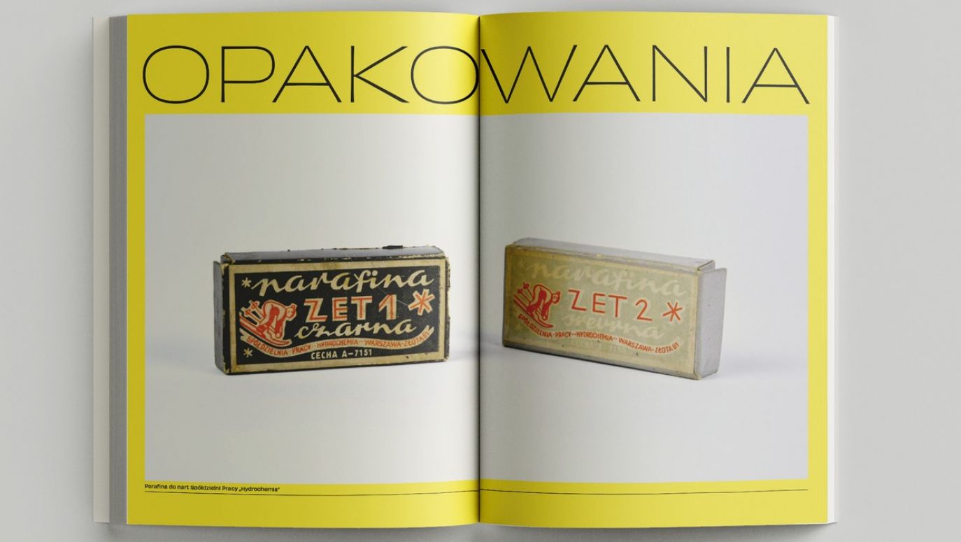
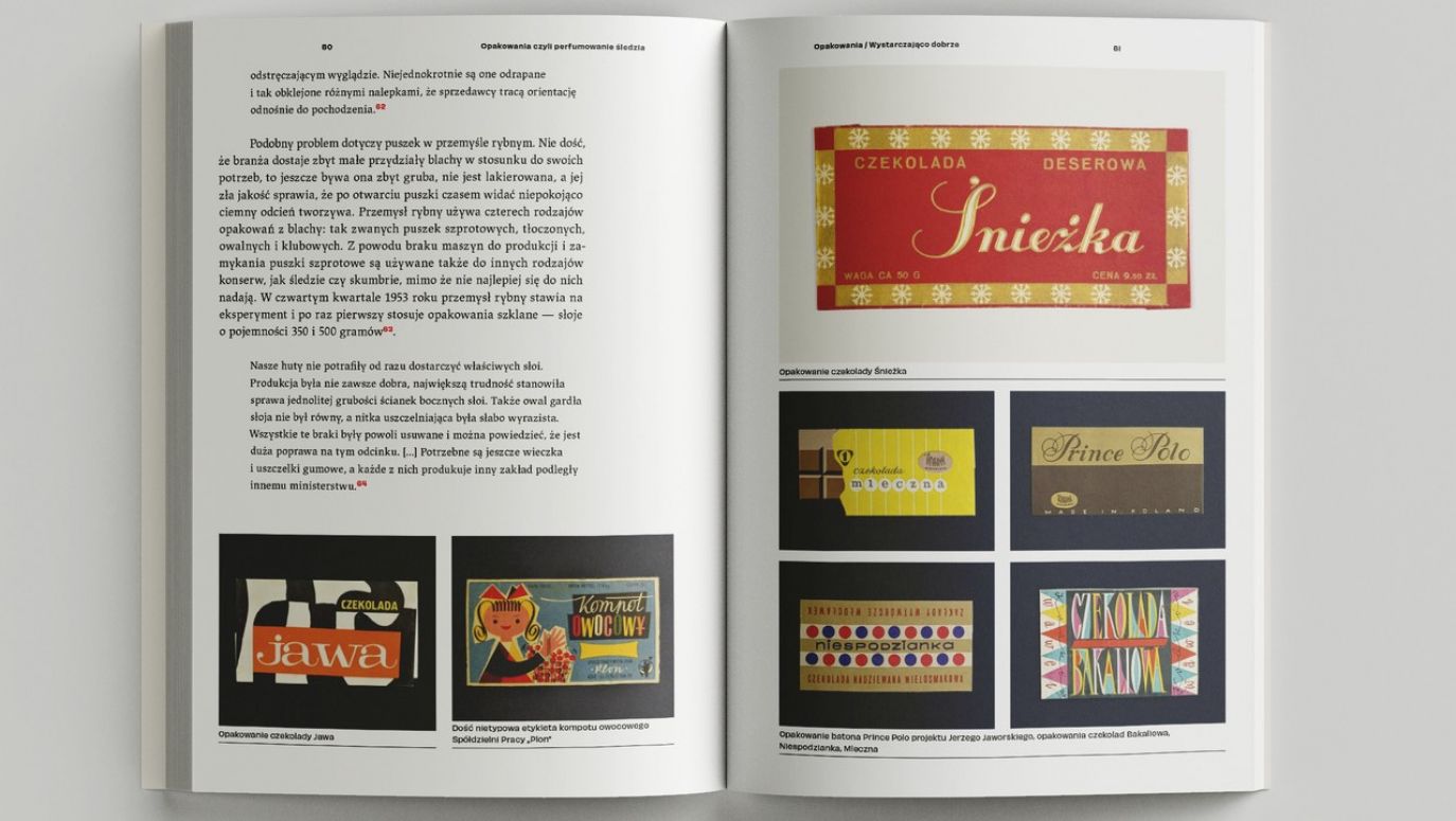
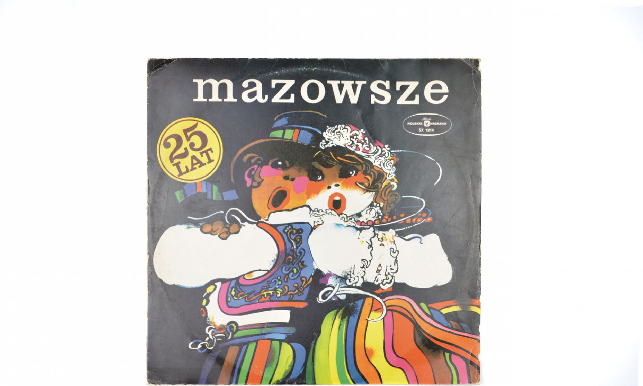
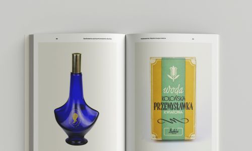
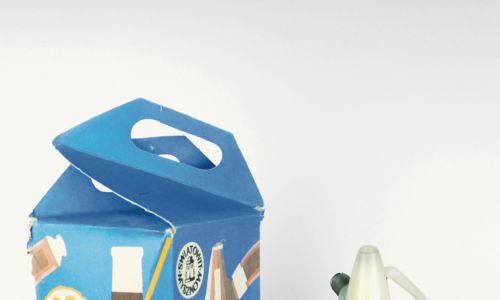
It is very easy (laughs). One of them belongs to me - it is a tin from Wawel brand sweets, with holes on sides, which can be transformed into a drum. Another package from this line of toys is a metal bucket of marmalade, which can be used as a toy in the sandbox after eating it. I also have a pack of "Szałowa" (Frenzy) perfume. I managed to get both the bottle and the paper packaging. The same goes for the bottle of Lechia "Renoir" perfume, but the icon of design and my warm memories is a woven poodle for a bottle of alcohol. A masterpiece of those times.

– Interviewed by Marta Kawczyńska

TVP WEEKLY. Editorial team and jornalists


– Translated by Tomasz Krzyżanowski
Katarzyna Jasiołek (born in 1982) - a graduate of Polish Philology at the University of Warsaw. She publishes in the trade magazine "Szkło i Ceramika" (Glass and Ceramics) and creates catalogues on design and design. She runs a blog Heliotrop (heliotropvintage.pl) about events related to design, architecture, photography, fashion, and also, under the brand of the blog, a podcast to which she invites artists, craftsmen, collectors and other people connected with design. She is the author of the book "Asteroid and half-couch. On Polish post-war design" and " Packaging, or the perfuming of herring".
Main photo: Packaging designers did not have to design something that had sales and marketing potential, because there were queues for everything anyway. They created at their own discretion and had something to boast about. Photo: Katarzyna Jasiołek archive
See more
Interviews wydanie 22.12.2023 – 29.12.2023
Japanese celebrate Christmas Eve like Valentine’s Day
They know and like one Polish Christmas carol: “Lulajże Jezuniu” (Sleep Little Jesus).
Interviews wydanie 22.12.2023 – 29.12.2023
Red concrete
Gomułka was happy when someone wrote on the wall: "PPR - dicks." Because until now it was written "PPR - Paid People of Russia".
Interviews wydanie 8.12.2023 – 15.12.2023
Half the world similarly names mothers, fathers and numerals
Did there exist one proto-language for all of us, like one primaeval father Adam?
Interviews wydanie 24.11.2023 – 1.12.2023
We need to slow down at school
Films or AI are a gateway to the garden of knowledge. But there are not enough students who want to learn at all.
Interviews wydanie 17.11.2023 – 24.11.2023
The real capital of the Third Reich
Adolf Hitler spent 836 days in the Wolf's Lair. Two thousand five hundred people faithfully served him in its 200 reinforced concreto buildings.